Varnam Designs
Varnam Designs
Varnam Designs
My Varnam Designs logo features bold, geometric shapes in red and black. The design uses dynamic lines and curves to create a strong, modern visual identity. I aimed for simplicity and balance, ensuring the logo is both versatile and impactful, while reflecting a professional yet creative tone for my brand.
My Varnam Designs logo features bold, geometric shapes in red and black. The design uses dynamic lines and curves to create a strong, modern visual identity. I aimed for simplicity and balance, ensuring the logo is both versatile and impactful, while reflecting a professional yet creative tone for my brand.
My Varnam Designs logo features bold, geometric shapes in red and black. The design uses dynamic lines and curves to create a strong, modern visual identity. I aimed for simplicity and balance, ensuring the logo is both versatile and impactful, while reflecting a professional yet creative tone for my brand.


Boba n' Chai
Boba n' Chai
Boba n' Chai
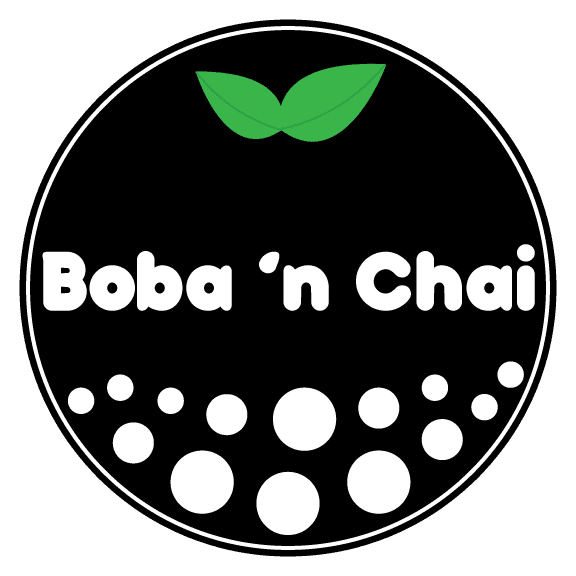
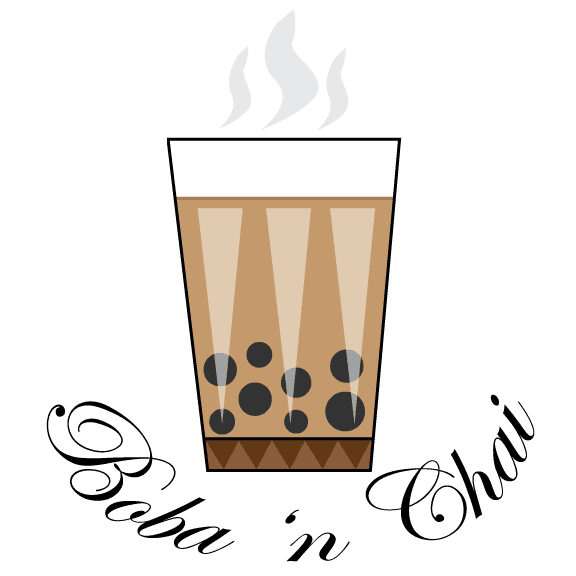
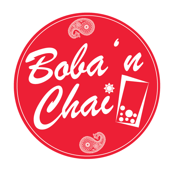
I designed multiple logo options for an Indian/Asian boba tea shop called "Boba n Chai." The goal was to create a unique brand identity that reflected both the cultural fusion and the inviting atmosphere of the shop. I offered the clients several different designs, each incorporating elements that balanced traditional and modern aesthetics, allowing them to choose the one that best captured their vision for the brand.
I designed multiple logo options for an Indian/Asian boba tea shop called "Boba n Chai." The goal was to create a unique brand identity that reflected both the cultural fusion and the inviting atmosphere of the shop. I offered the clients several different designs, each incorporating elements that balanced traditional and modern aesthetics, allowing them to choose the one that best captured their vision for the brand.
I designed multiple logo options for an Indian/Asian boba tea shop called "Boba n Chai." The goal was to create a unique brand identity that reflected both the cultural fusion and the inviting atmosphere of the shop. I offered the clients several different designs, each incorporating elements that balanced traditional and modern aesthetics, allowing them to choose the one that best captured their vision for the brand.






Made 2 Wynn
Made 2 Wynn
Made 2 Wynn
I created official logos for the American rapper "Made 2 Wynn," who is one of my connections from college. The designs were tailored to represent his unique style and brand as an artist, combining bold typography and creative elements to capture his musical identity. This project allowed me to collaborate closely with the artist, ensuring the logos reflected his personality and vision for his brand.
I created official logos for the American rapper "Made 2 Wynn," who is one of my connections from college. The designs were tailored to represent his unique style and brand as an artist, combining bold typography and creative elements to capture his musical identity. This project allowed me to collaborate closely with the artist, ensuring the logos reflected his personality and vision for his brand.
I created official logos for the American rapper "Made 2 Wynn," who is one of my connections from college. The designs were tailored to represent his unique style and brand as an artist, combining bold typography and creative elements to capture his musical identity. This project allowed me to collaborate closely with the artist, ensuring the logos reflected his personality and vision for his brand.





High Point University Butterfly Icon
High Point University Butterfly Icon
High Point University Butterfly Icon
During my time as High Point University's Student Digital Content Specialist, I had the opportunity to design the Butterfly badge, which was given to the upcoming fall freshman class. This project allowed me to create a meaningful and memorable symbol for new students, combining creative design with the university's welcoming spirit. It was a rewarding experience to contribute to the school's tradition through my design work.
During my time as High Point University's Student Digital Content Specialist, I had the opportunity to design the Butterfly badge, which was given to the upcoming fall freshman class. This project allowed me to create a meaningful and memorable symbol for new students, combining creative design with the university's welcoming spirit. It was a rewarding experience to contribute to the school's tradition through my design work.
During my time as High Point University's Student Digital Content Specialist, I had the opportunity to design the Butterfly badge, which was given to the upcoming fall freshman class. This project allowed me to create a meaningful and memorable symbol for new students, combining creative design with the university's welcoming spirit. It was a rewarding experience to contribute to the school's tradition through my design work.


Zero Lag
Zero Lag
Zero Lag
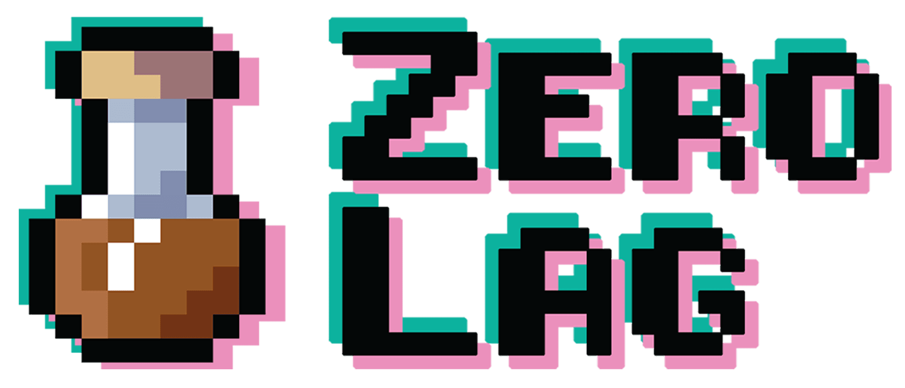
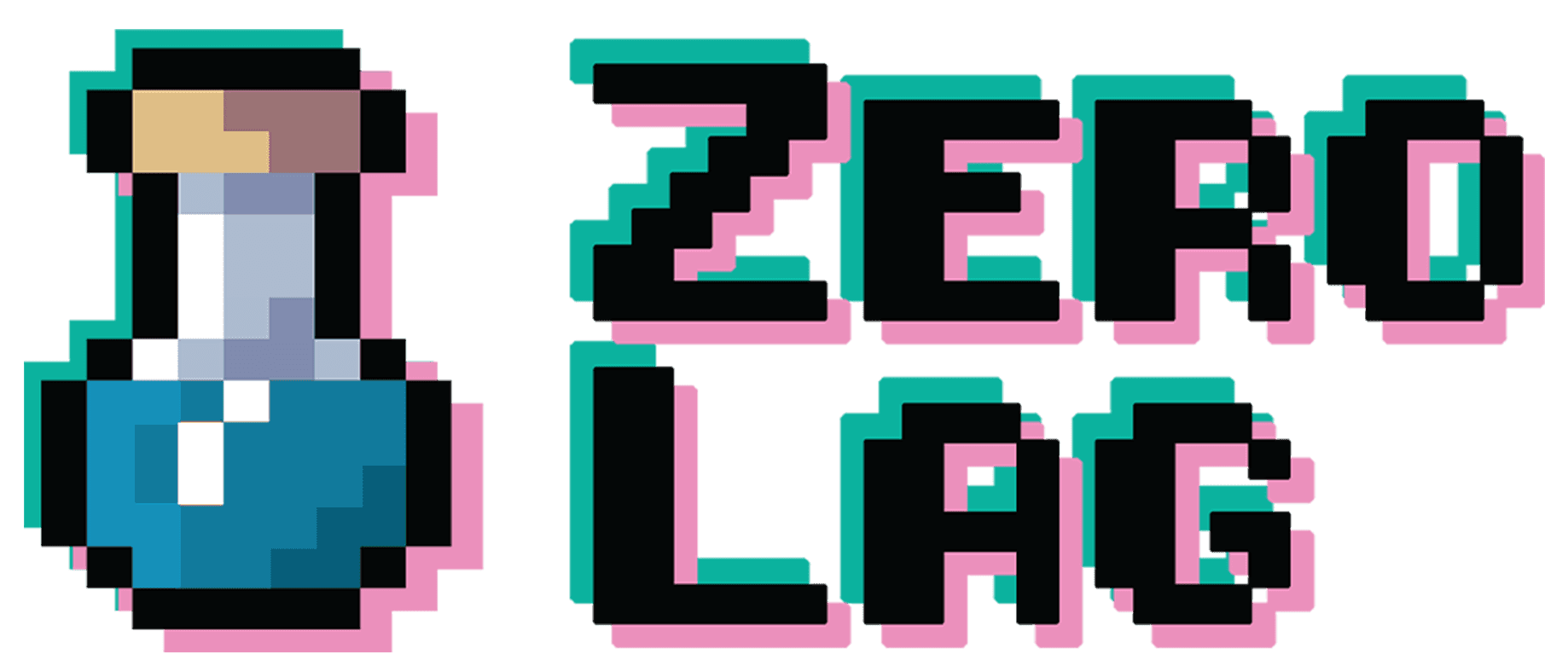
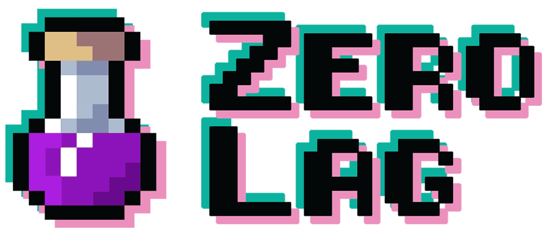
In my senior year at High Point University, I worked on a project called "Zero Lag" in my Visual Literacy and Typography class. The goal was to create a unique tea brand with a specific target audience, and I decided to design a brand that would appeal to gamers. "Zero Lag" was crafted to resonate with the gaming community, offering a tea that not only refreshed but also enhanced focus and energy for long gaming sessions.
I developed the brand’s visual identity, incorporating bold, tech-inspired elements that would catch the eye of gamers. The packaging, logo, and marketing materials were all designed to reflect the fast-paced, high-energy world of gaming while maintaining a sleek and modern aesthetic. This project allowed me to combine my design skills with a creative concept tailored to a niche audience.


School Projects/Misc.
Logos
Logos
Logos
Logos
Boba n' Chai
I designed multiple logo options for an Indian/Asian boba tea shop called "Boba n Chai." The goal was to create a unique brand identity that reflected both the cultural fusion and the inviting atmosphere of the shop. I offered the clients several different designs, each incorporating elements that balanced traditional and modern aesthetics, allowing them to choose the one that best captured their vision for the brand.


Varnam Designs
My Varnam Designs logo features bold, geometric shapes in red and black. The design uses dynamic lines and curves to create a strong, modern visual identity. I aimed for simplicity and balance, ensuring the logo is both versatile and impactful, while reflecting a professional yet creative tone for my brand.


Made 2 Wynn
I created official logos for the American rapper "Made 2 Wynn," who is one of my connections from college. The designs were tailored to represent his unique style and brand as an artist, combining bold typography and creative elements to capture his musical identity. This project allowed me to collaborate closely with the artist, ensuring the logos reflected his personality and vision for his brand.


High Point University
Butterfly Icon
During my time as High Point University's Student Digital Content Specialist, I had the opportunity to design the Butterfly badge, which was given to the upcoming fall freshman class. This project allowed me to create a meaningful and memorable symbol for new students, combining creative design with the university's welcoming spirit. It was a rewarding experience to contribute to the school's tradition through my design work.


School Projects/Misc.
School Projects/Misc.
Zero Lag
In my senior year at High Point University, I worked on a project called "Zero Lag" in my Visual Literacy and Typography class. The goal was to create a unique tea brand with a specific target audience, and I decided to design a brand that would appeal to gamers. "Zero Lag" was crafted to resonate with the gaming community, offering a tea that not only refreshed but also enhanced focus and energy for long gaming sessions.
I developed the brand’s visual identity, incorporating bold, tech-inspired elements that would catch the eye of gamers. The packaging, logo, and marketing materials were all designed to reflect the fast-paced, high-energy world of gaming while maintaining a sleek and modern aesthetic. This project allowed me to combine my design skills with a creative concept tailored to a niche audience.
